Client: Solo project
Role: Product Designer / Developer
Time: 2017-2018, 2021
Team size: 2
Platforms: Built in Unity for iPhone, iPad and Mac
Users: Kids 10+
Idea
Motivated by linear and static digital learning tools used in Swedish schools, I got the urge to show how you can better make use of the digital medium. The idea was to create something more dynamic and expressive, with a higher level of interactivity, to promote learning by curious exploration. The theme I choose was astronomy, and specifically how the earth moves and how that affects our life on it.

This is an early sketch visualizing how a user can explore the scene from different perspectives.
The Year camera, that shows how Earth moves around the sun.
The Earth camera, that looks down at Earth from the Sun.
The Location camera, that looks down at a location on Earth, following like geo stationary satellite.
Here, users can explore the connection between the Earth's rotation around its own axis and the time of day.
Here, users can examine how much daylight a location gets at different times of the year.
Here, users can explore from the ground how the sun travels across the sky during different times of the year. This shows the same thing as in the previous video, but seen from a completely different perspective. Being able to discover something from different points of view can help make otherwise abstract phenomena concrete.
The Daylight Graph
This daylight graph shows the daylight time over a year. First I calculate sunrise and sunset times at a given place for all the days of the year. The days of the year run horizontally while time of day runs vertically. The bright area represents daylight. This graph can help explain phenomena like midnight sun and polar nights. It can also help understanding why some places have more distinct seasons than others. For example, Kiruna has a huge difference in the amount of daylight over the year, compared to Ecuador, where every day looks the same. For the sake of clarity the sun sets behind the semi transparent night area.
The Seasons spinner
Working in 3D I took advantage of placing GUI objects in both screen space for HUD elements like buttons or the giant watch, and world space for pins and labels etc placed in the 3D scene. When designing a tool for setting the time of year I wanted some thing circular and endless, that wraps around, year after year, instead of say a progress bar that has a beginning and an end. I went with a sphere that wears the months of the year as a belt, with small strokes and gaps representing days.
Being a sphere it could also represent Earth and show seasons on the north and south hemisphere respectively. I marked equinoxes and solstices for guidance and to stay consistent with other UI elements in the app.

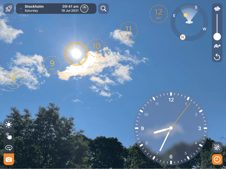
Compass UI
This is a compass UI to help users with orientation when on the ground. As the user is always facing the screen, the person in the middle is always facing up/forward. While looking around in the world the direction letters rotate accordingly. To stay legible they don’t rotate. North is highlighted for quick orientation at a glance. The users field of view is shown with the white gradient. The suns position according to the user can also be seen.

Icons
For icons I wanted to go with apples SF symbols because they are of good quality and users are already familiar with them from using other apps on the platform. However a lot of the icons that I needed was not available among the SF symbols so I had do make my own, trying to make them match the same style. In this image only five icons are original SF symbols. Can you spot them?
Learning vs Exploring

At first I did not know how to combine a high level of interactivity with effective learning. It was clear that people who had some previous knowledge of astronomy quickly started to experiment trying to verify what they already knew, while people who knew too little got overwhelmed and just spun the earth because it looked fun but quickly lost interest.
I needed a more structured and stripped-down mode for teaching about astronomical phenomena. I created interactive step-by-step lessons with a dynamic GUI only showing the necessary elements needed in each step, paired with explanatory text that prompted users to interact.
Lessons were accompanied with a sandbox mode of the app where users could go after completing a lesson, to experiment and verify the knowledge they just usurped. The sandbox mode offered full control of all the apps features, enabling exploration.
Lesson icons

I designed 17 lessons, teaching most of the astronomical concepts children needs to know in middle school. Each lesson got it's own icon with an orange highlite hinting at the subject. The name "lessons" were later changed into "guides" since users thought that lessons were too strongly associated with school and therefore having negative connotations.
Space & Time
Astronomical aha-moments
Result
Towards the end of the project I got help from my friend Oscar to finish it up, making sure everything worked as intended. The app was named Space & Time and it was released on the Apple App Store.
By integrating 3D visuals and a high level of interaction, the app enhanced understanding and retention of learned concepts. Though well-received with decent downloads upon release, its status as a hobby project without a marketing budget made it hard for the app to gain traction in the App Store.