Elevating Sweden's most beloved App
Client: Getswish AB
Role: Design Lead
Team size: 16
Platforms: iOS, android
Users: 90% of all Swedes


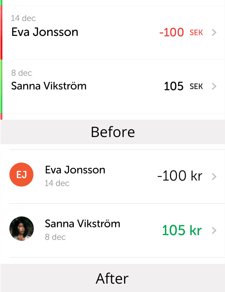
Before
After
Objectives
The Swish app tem were on a mission to redesign the app, these were the objectives we had: - Overall modernization of the look to stay relevant - Highlight the QR-flow to enable quicker transactions - Make users send more cards, for delight - Make visual elements more accessible - Add iPhone X support
Connect to Content
Add layers or components to swipe between.
Design Challenge
The graphical guidelines stated “embrace whitespace”. With an increasing amount of features this was challenging. What features are most important and which ones can we move out of the spotlight? Also, making changes to an app that people love can be scary.
Design Challenge
The graphical guidelines stated “embrace whitespace”. With an increasing amount of features this was challenging. What features are most important and which ones can we move out of the spotlight? Also, making changes to an app that people love can be scary.
Process
In tight collaboration between UX and UI we iterated on the interface while performing biweekly usability tests. Together with developers we switched to using more native components to stay compatible and away from bugs. For accessibility we tested with visually impaired and users as well as people with cognitive disabilities.
Solution
We gave buttons gradients and added more rounding to corners for a modern and friendly feel. We overlooked contrast values for readability. We made labels larger and introduced a new secondary interaction color to clarify graphic hierarchies. We added a second QR scanner in the payment flow and while adding more cards we also made them part of the payment flow. We added support for dynamic font sizes and added alt texts to all elements. To avoid motion sickness from animation of large objects I invented a motion system utilizing small but distinct movements in combination with direction and fading to accomplish a morph-like behavior.
Results
The amount of scanned QR codes went up 400%. People sent 8 times as many cards as before. The app could now more efficiently be used by visually impaired. The apps rating went from 3.7 to 4.2. I successfully lead the team to reinforce Swish's position as the leading payment app in Sweden.
Results
The amount of scanned QR codes went up 400%. People sent 8 times as many cards as before. The app could now more efficiently be used by visually impaired. The apps rating went from 3.7 to 4.2. I successfully lead the team to reinforce Swish's position as the leading payment app in Sweden.