
Client: Mojang Studios
Role: UX Designer (in-game)
Time: 2022-2024 (on and off)
Team size: 6
Platforms: PC, mobile, consoles
Target group: Most Minecraft Players
A long awaited storage solution
While Mojang kept adding more items to Minecraft, players saw their inventories filling up more quickly. This was a problem that needed to be fixed.
Already in 2020 Mojang presented a feature called the Bundle at their yearly event called Minecraft Live. Since then the feature had been out as an experiment for some players. However it was never released due to the touchscreen interaction design was not good enough.
Mojang came from a history of promising features for an update that ended up releasing years after the initial promised release date. When I started at Mojang in 2022 Bundles was the last promised feature that they still had not released. I was given the task to ”get bundles out”.
Basic idea of the Bundle
A bundle is an item storage solution that aim to prevent players inventory from getting full too quickly without affecting the inventory’s maximum storage capacity.
The inventory holds 36 item slots. Each slot typically holds up to a maximum 64 items of the same kind. When exploring the world you often find small amounts of a lot different items. That means that even if a slot only holds one item of the 64 it can hold, that unused space can not be used by other item types.
The bundle is stored in a slot and it also holds an equivalent of a full item stack, but it can hold different item types at the same time. That allows players to drastically compact their inventory.
Process and usability testing
When I inherited the feature it was mainly designed with keyboard and mouse interface in mind. No UX designer had been part of the project from the start.
The fact that Minecraft has two codebases* makes it quite a bit more difficult for anyone involved in the development of the game. What is easily done in one codebase can take months to do on the other and vice versa. This made it key for me to have a close collaboration with developers from both editions at an early stage of the project. Believe me, there were things I wanted to do that just wasn't possible.
Throughout the project I made usability tests, both on my Figma prototypes and on in-game prototypes. Unfortunately I could not get testers from the wild due to security reasons so I recruited testers as far from the game teams as possible. For people to know as little as possible about the feature.
For every usability test that I conducted, I came back to the team with lots of new insights. What didn't work and possibly why. I involved the team in finding good and realistic solutions. I was also part of both the UX craft and the Game Design craft so I shared my designs at craft meetings to get feedback.
I put most of my focus on the touchscreen interaction design, where my skills were mostly needed, making sure that the feature was at least as good played on a phone.
*Minecraft is available in two editions, Minecraft Java Edition for PC and Mac and Minecraft Bedrock Edition for PC, consoles and mobile, written in C++
Interaction: From hard to use to intuitive
Before starting designing on the feature I read lots of user feedback gathered by a community manager. The most common comment was that they wanted to be able to store more in bundles. I also looked at collected user data from players engaging with the feature. Unfortunately the data wasn't at a detail level that made it useful for me at the moment.
I conducted a usability test of the current state of the feature, on mobile. This showed that users had big problems opening up bundles to access the contents from them. To be able to add or remove items to a bundle you had to first open the bundle, this was made by long-pressing on a bundle. No other items require a long-press in the game, no other UIs either. A long-press is a hidden action that is not top of mind for users trying out a new feature. If you as a player don't manage to add or remove things to a bundle the feature renders useless.
The tap interaction was already taken by item movement (no drag'n drop available) so we needed some other solution. I came up with two alternatives that was implemented in the game and tested on users.

B: Opens bundle on first tap

As neither of the solutions worked I had to go back to the drawing board again but this time with insights to guide me in my design decisions.
Another problem that was fond in the testing was that users tried to interact with the bundle tool-tip, despite my efforts to make it look less interactive. I had the choice to either remove the tool-tips completely on touch devices or making them interactive. I went with the later. This was not an easy thing for developers to solve but eventually I had a solution c prototype ready.
By making the tool-tip interactive a new state appeared, the open bundle with nothing selected. This state could be used as the selected state! This meant that I could combine the best from solution a with the best with solution b. In other words combining the selected and open state into one.
⭐️ C: Select AND open bundle on tap

Tooltip evolution
While keeping developers busy developing prototypes for my different hypothesis I spent some time making the tool-tip better, both functionally and visually.
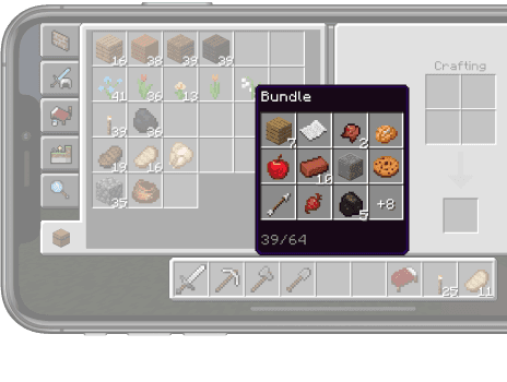
What’s in the bundle?
Items were added and removed with a last in first out logic. When an item was added to a bundle it got added in the top left and pushed all other items to the right and downwards. With items constantly moving around like this, it became difficult for users to remember the contents of a bundle. Items moving around also made it more time consuming to finding specific items.
Before
After

Grid size

Before
After
A maxed out bundle could hold 64 different items. Such a large grid wouldn’t fit in a phone. However it would be super unlikely that a player filled up a bundle like that from normal gameplay.
It is resonable to assume that if you put a lot of things in a bag you might not be able to see the things at the bottom.
A smaller tool-tip also covers the underlying behind it less. By only showing the 12 most recent items added to a bundle, the grid gets a more manageable size for all platforms. If a bundle contains more than 12 item types we can utilize a surplus item count in the bottom right slot to hint that there are more items than you can see.
Tool-tips and interaction
Before
After
We saw from usability testing that users tried to interact with the tool-tip in ways not possible. Since grids in tool-tips are not interactive in the same way as other grids in the game I decided to take away the iconic grey slots. Now the tool-tip was not sending out wrong signals but instead looked more like other tool-tips in the game.
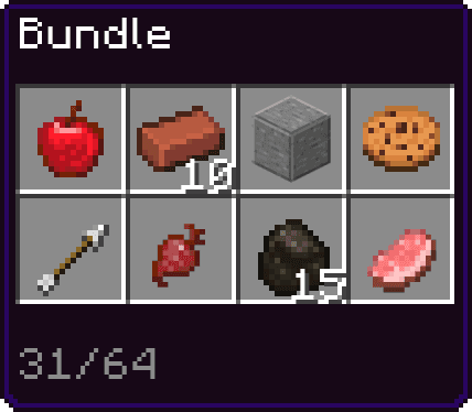
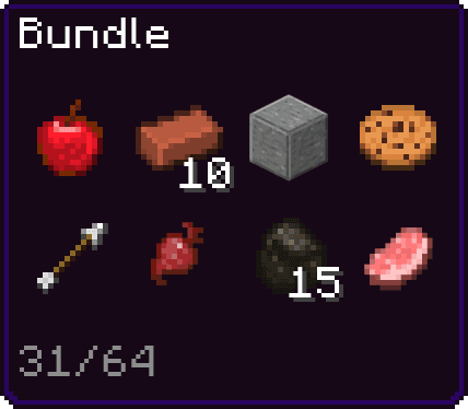
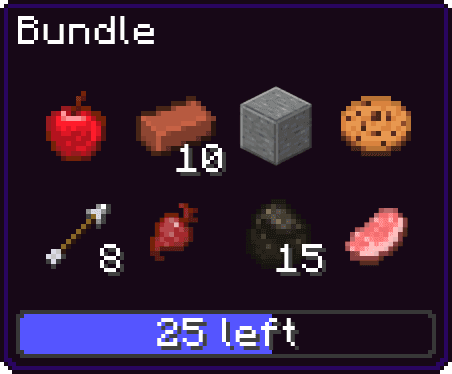
How full is the bundle?
Players preferred to know how much free space was left in a bundle rather than how many objects it held in total. When playing a game it's important to have a fluent UI that quickly can give the player the information it needs. Hence, we should not make our users do math like 64 - 39 = 25 to find out how much room is left in a bundle.
I added a progress bar to communicate the fullness quicker. I also changed the text to show how much free space is left to save the user that calculation.

Before
Intermediate

After
Bundles were designed to hold the equivalent of one full stack of items. Due to some items having a max stack size of 16 instead of the standard 64 they occupied four slots in the bundle. That made users confused. "It said that It could take 4 more items, but I could only fit one of these two?!". After talking to game designers it turned out that we could not easily unify stack sizes so I decided to remove the text all together. However, this was not a big loss since players opted for a quicker way to deliver the information rather than an exact number. Without the text the tool-tip looked cleaner and became quicker to scan.
In this video you can see how a bundle is filled on a touch device. Since the bundle grid manages itself users saves one tap moving objects compared to moving them to a chest, where the destination slot also has to be defined.
Notice how the tool-tip grows when more items are being added.
Emptying a bundle on the ground (on desktop)
Before, when users emptied a bundle, all items were thrown out at the same time, in the exact same position on the ground. That made it impossible to choose what to pick from the pile. This became frustrating to players if they only had a few slots free in their inventory and wanted to pick up a certain item from the pile.
I changed the mechanic to only unload one item at a time. That gave players complete freedom on both the unloading and the pick-up procedure. By long-pressing the unload button items unloads in a stream with a slight delay in between. This makes it possible to spray items around you.
Bundle identification
The Minecraft community is very vocal and it is important that they feel that people at Mojang respond to their feedback. The most common request from users was that they wanted to be able to color their bundles to give them a unique look. If you had five bundles it could be hard to know which one is which without having to open them looking at the content. I made sure to get this into the scope.

When selecting an object in a bundle tool-tip, to clarify that you are in the process of taking that item out of the bundle. I added an object poking out of the bundle.
